How to Find Mobile Conversion Problems in WooCommerce
Mobile is 70-78% of WooCommerce traffic and converts roughly 60% as well as desktop. Diagnose which of the 4 mobile problems is yours using only Statnive's Devices report + the Pages report — no GA4, no heatmaps, no Lighthouse dashboard.
Two facts that every solo WooCommerce owner can see in their analytics dashboard:
- Mobile is 70–78% of your traffic.
- Mobile converts at roughly 60% of desktop’s rate.
The arithmetic: if you have 10,000 mobile visits/month converting at 1.8% and 3,000 desktop visits/month converting at 3.0%, mobile generates 180 orders and desktop generates 90. Mobile is already your bigger revenue engine — but a one-percentage-point lift on mobile is worth twice what the same lift on desktop is worth.
That math is why mobile CRO is the single highest-leverage investment for a solo Woo store. The problem is that almost every “WooCommerce mobile optimization” post on the SERP is a 25-item tactic listicle. That doesn’t help when you don’t know which mobile problem is yours.
This post is the diagnostic, not the listicle. Four mobile problems ranked by detection method, two-pane workflow you can run in 5 minutes, and the five evidence-backed mobile bottlenecks in priority order.
What this post answers
- The mobile-CR-to-desktop-CR ratio as the diagnostic starting point.
- The 4 mobile problems, each with its own detection rule (no GA4 required).
- The 5-minute two-pane mobile audit using only Statnive’s Devices report + Pages report.
- The 5 evidence-backed mobile conversion bottlenecks, in priority order.
- The 4 mobile anti-patterns the SERP still recommends — and the research that debunks them.
Start with the ratio: mobile CR ÷ desktop CR
Open your WooCommerce Reports → Orders. Filter by date range (last 30 days is reasonable for a solo store). Sort orders by their source device — most WooCommerce themes record this in order metadata, and if your store doesn’t, the WC 8.5+ Order Attribution feature does.
Compute:
mobile_orders ÷ mobile_visitors = mobile_CR
desktop_orders ÷ desktop_visitors = desktop_CR
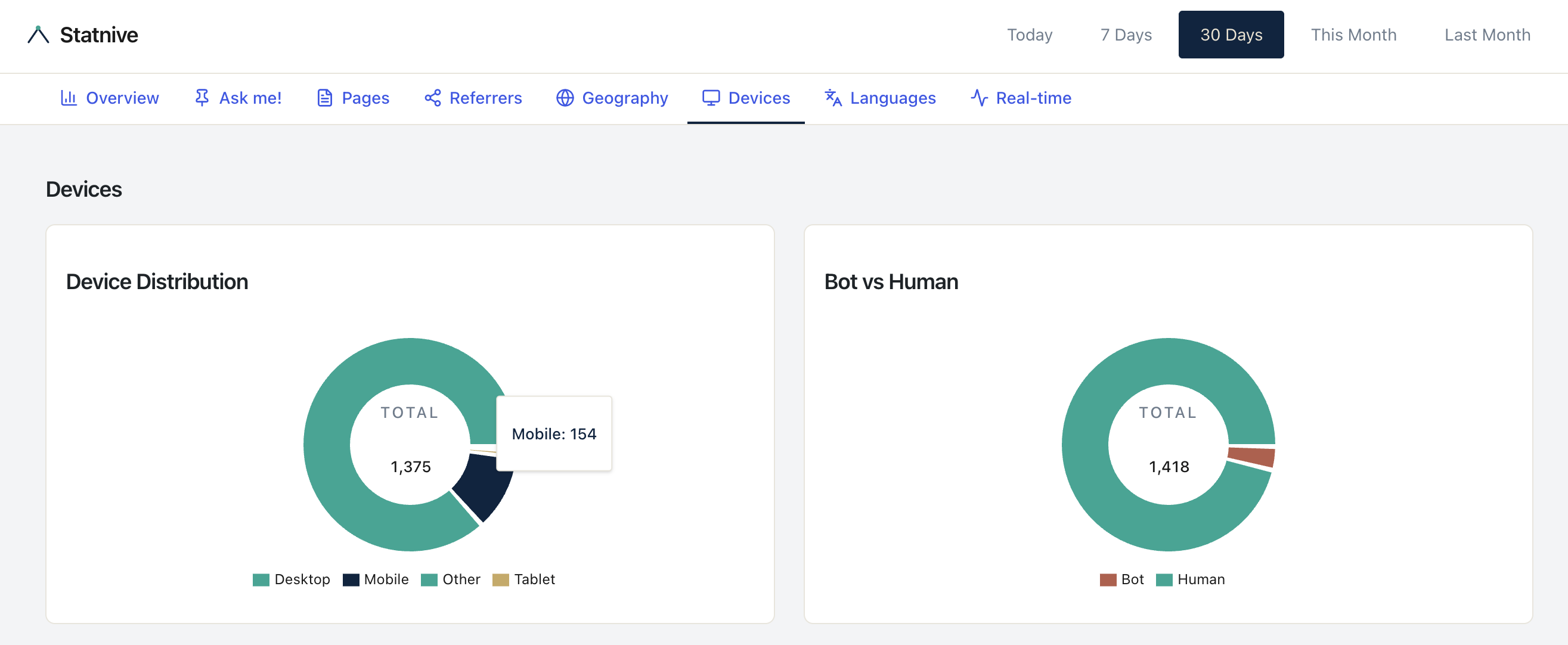
mobile_CR ÷ desktop_CR = your ratioWhere do your visitors come from? Open Statnive → Devices report. The Device Type breakdown gives you mobile_visitors and desktop_visitors.
Baseline numbers (per Dynamic Yield benchmark data published via Oberlo, October 2024):
- Desktop ecommerce conversion: 3.85%
- Tablet: 3.49%
- Mobile: 2.85%
- Mobile ÷ desktop ≈ 0.74
Some sources report ratios as low as 0.50–0.55 for apparel, electronics, and jewelry. The right reference is your own store’s ratio compared to its own history, not a universal benchmark. Track the ratio monthly; that’s your single most important mobile-health KPI.
The 4 mobile problems, each with its own detection method
This is the diagnostic framework. Most “mobile CRO” posts skip straight to fixes; the actual win is knowing which problem you have.
Problem 1 — Traffic that never reaches checkout
Detection: In Statnive’s Devices report, mobile sessions are within 15 percentage points of your desktop sessions count, but in WooCommerce Analytics → Orders the mobile orders are below 30% of the volume you’d expect from share-of-traffic.
What’s happening: mobile visitors are landing, looking at maybe one page, and bouncing — they never reach /cart or /checkout. The funnel is leaking at the top.
Where to look next: Statnive → Pages → Entry pages, sorted by Entry Count. Identify mobile-heavy entry pages (cross-reference Devices report). If those entries have high exit count, you have a top-of-funnel mobile problem — usually a slow page, a non-mobile-optimized hero, or an above-fold CTA that’s not visible on a 375px viewport.
Problem 2 — Traffic that reaches cart/checkout but fails
Detection: mobile visitors do reach /checkout (visible in your Pages report) but mobile orders are still proportionally low. The funnel is leaking at the bottom.
What’s happening: the visitor put a product in the cart, possibly even started checkout, and bailed mid-form. This is the classic Baymard pattern: extra shipping costs revealed too late (39% of US abandoners), forced account creation (19%), checkout form too long (18%), payment provider mismatch.
Where to look next: open /checkout on your store from a 375px-viewport mobile browser. Walk through. Count the fields. Time the form. Compare against Baymard’s mobile-checkout checklist.
Problem 3 — Product-page mobile bounce
Detection: in Statnive’s Pages report, your top PDP entry pages have high exit counts. In the Devices report, mobile is dominant. There’s no easy “device-filter on Pages” in the UI today (workaround below), so this is a two-pane inference.
What’s happening: mobile visitors land on your product page, can’t find the buy button without scrolling, or get hit with image-gallery jank, or wait too long for the page to load.
Where to look next: open your top PDP from a real mobile device (not a desktop browser narrowed to 375px — actual phones have keyboard, touch, and Safari ITP quirks the desktop emulation hides). Time the LCP with Google PageSpeed Insights. Verify the “Add to Cart” button is visible above the fold without scrolling. Check that the image gallery is swipeable without jank.
Problem 4 — Wrong audience to begin with
Detection: mobile traffic share is high, but the traffic source is one specific channel (often paid social on Meta) and the bounce rate is universally >75% across all mobile entry pages.
What’s happening: the ads are targeting people who don’t want what you sell, or the ad creative doesn’t match the landing page. Your store’s mobile UX is fine; the upstream targeting is broken.
Where to look next: Statnive → Referrers → filter to the suspect campaign’s UTM source/medium. Compare bounce + duration vs. site average. If the campaign is failing the channel-health rule (bounces above average + duration below average), the issue is the campaign, not mobile UX. See the traffic-sources playbook for the full diagnostic.
The 5-minute two-pane mobile audit
This is the workflow. No GA4. No Lighthouse dashboard. No heatmap tool. Two browser tabs and your WooCommerce admin.
Tab 1 — Statnive Devices report:
- What’s your mobile share of total sessions? (Should be 60–80% for most consumer-facing Woo stores.)
- What’s your mobile bounce rate vs. your desktop bounce rate? (Compute the delta in percentage points.)
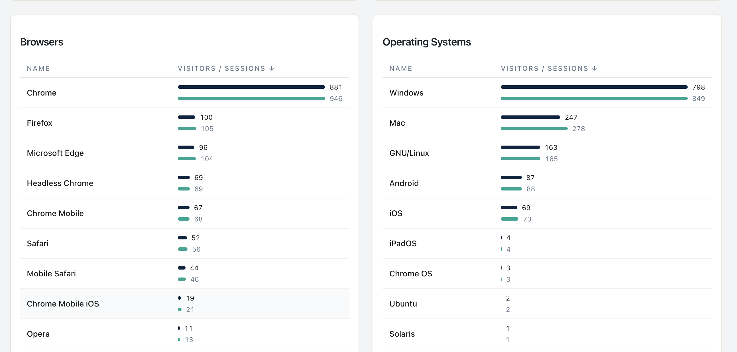
- Which browsers dominate mobile (mobile Safari vs. Android Chrome)?
Tab 2 — Statnive Pages report:
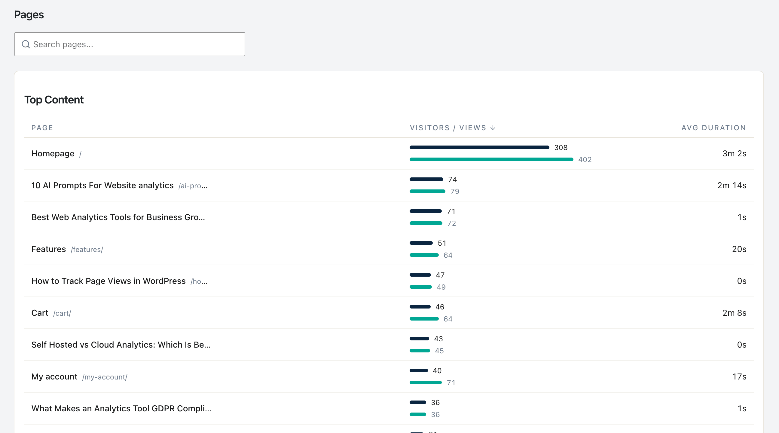
- Sort by Entry Count descending. These are your mobile landing pages too (mobile is the majority of traffic).
- Sort by Exit Count descending. Note any
/product/,/cart/, or/checkoutpage in the top 5.
Tab 3 — WooCommerce Analytics → Orders:
- Filter to the last 30 days. Note mobile-attributed orders count.
- Compute:
mobile_orders ÷ (mobile_sessions from Tab 1)= mobile CR. - Same for desktop.
- Compute the ratio. Compare to baseline 0.60–0.75.
Decision rule:
| Ratio | Interpretation | Action |
|---|---|---|
| 0.70+ | Within normal range | Maintain — no urgent mobile fix |
| 0.50–0.69 | Slight underperformance | Start with Problem 3 (PDP mobile bounce) |
| 0.30–0.49 | Material problem | Run all 4 problem detections; usually Problem 2 or 4 |
| < 0.30 | Catastrophic | Likely Problem 4 (wrong audience) AND Problem 1 combined |
Five minutes, no third-party tool, defensible answer.
Honest caveat: the Pages report can’t be filtered by Device Type in the current Statnive UI — the cross-reference is manual, not automated. A device-filtered endpoint is on the roadmap. Until then, the two-pane workflow is the working substitute.
The 5 evidence-backed mobile bottlenecks, in priority order
When you’ve identified which problem you have, here’s the priority queue of fixes. Each is anchored to specific research, not vibes.
Bottleneck 1 — Mobile LCP (Largest Contentful Paint) above 2.5 seconds
Evidence: The Deloitte/55/Google Milliseconds Make Millions study (late 2019, pre-Core-Web-Vitals): a 0.1-second mobile-speed improvement produced an 8.4% retail conversion lift and a 9.2% AOV lift across 30 million sessions on 37 brand sites. The study predates the formal Core Web Vitals signal, but the effect remains widely-cited.
How to measure: Google PageSpeed Insights. Enter your top mobile entry page. Note the mobile (not desktop) LCP. Target ≤2.5 seconds; the 2026 LCP threshold updates set “good” at ≤2.0 seconds.
How to fix: image optimization (WebP/AVIF), lazy-load below-the-fold, server caching plugin (WP Rocket, Cache Enabler), reduce JavaScript on landing pages.
Bottleneck 2 — Above-the-fold CTA not visible on 375px
Evidence: Baymard’s mobile PDP research — the primary CTA must be reachable without scrolling on a 375px viewport (the iPhone SE / iPhone Mini width). Per Nielsen Norman Group attention research, 57% of viewing time is above the fold on modern responsive sites.
How to measure: open your top PDP in Chrome DevTools at 375×667. See the buy button without scrolling? No = problem.
How to fix: reduce hero image height, move title-and-price block higher, ensure CTA is in the thumb zone (bottom-right for right-handed thumb).
Bottleneck 3 — Product image gallery friction
Evidence: Baymard correlation: ability to fluidly browse all product images correlates ~0.6 with add-to-cart rate. The most-common failure modes: zoom doesn’t work, swipe lags, gallery only shows 1 image without indicator that more exist.
How to measure: on a real phone (not desktop emulation), open a PDP. Swipe through all images. Try to zoom. If anything stutters or doesn’t work, fix it.
How to fix: swap to a theme/plugin with a proven mobile gallery (Astra, Botiga, Storefront 4.x, Kadence). Test on iOS Safari specifically.
Bottleneck 4 — Checkout form too long, password requirement, captcha
Evidence: Baymard’s checkout-flow research: the median large-site checkout has 14.88 fields; cutting to the minimum produces 25–35% conversion lift in mobile-specific contexts. 24% of US abandoners cite forced account creation; 19% cite the password requirement specifically.
How to measure: count visible required fields on /checkout on mobile. If > 8, you’re above the optimum. Check if account creation is required.
How to fix: WooCommerce → Settings → Accounts & Privacy → enable “Allow customers to place orders without an account”. Disable optional fields (company, address line 2, order notes, often phone) in WooCommerce → Settings → Advanced → Account & Privacy. Ensure each input has the correct inputmode so mobile keyboards optimize (numeric for postal code, email for email).
Bottleneck 5 — Payment provider mismatch
Evidence: Stripe’s Apple Pay adoption research suggests an 8–15% mobile conversion lift when Apple Pay is available, varying by category and region. Per Stripe and PayPal data, mobile shoppers prefer one-tap payment over manual card entry.
How to measure: open /checkout on iPhone. Is there an Apple Pay button visible? On Android, Google Pay? If only “credit card” appears, you have a payment-friction problem.
How to fix: enable Apple Pay + Google Pay via WooPayments, Stripe, or Square. The plugin install is 5 minutes; enabling Apple Pay requires a domain verification step that adds another 15 minutes.
Four mobile anti-patterns to skip
These appear in every “mobile WooCommerce optimization” post. The research debunks them.
- “Make your site responsive — that’s mobile optimization.” Per Nielsen Norman Group, responsive design is a starting point, not a strategy. Responsive ensures the site loads on mobile; it doesn’t optimize the experience for thumb-based input, slower networks, or smaller viewport priorities.
- “Add a mobile-only popup to capture emails.” Per Google’s Intrusive Interstitials policy (2017), full-screen mobile interstitials can trigger a ranking penalty. Per Baymard’s mobile-UX research, mobile popups have a 23–31% abandonment cost vs. their desktop equivalents. Use inline forms on non-commerce-intent pages instead; do not popup on PDP, cart, or checkout.
- “Hamburger menus everywhere.” Per NN/g’s hamburger menu research, hidden menus reduce discoverability by ~50%. Mobile-essential primary navigation (category, cart, search) should be visible, not hidden behind a hamburger. The hamburger is acceptable for secondary nav only.
- “Mobile-first means smaller fonts to fit more above the fold.” Per WCAG 1.4.4, text must be resizable to 200%. Apple HIG specifies 17pt minimum body text; Material Design specifies 16sp. Smaller fonts violate accessibility and reduce conversion among the 50%+ of mobile shoppers over 40 with mild visual impairment.
WooCommerce-specific mobile gotchas
Three theme + plugin facts that change how your mobile data reads.
- Block-based checkout > shortcode checkout on mobile, both for UX and for analytics cleanliness. The block-based checkout was redesigned mobile-first with shorter visible fields and better keyboard handling. If you’re still on the shortcode checkout in 2026, the migration is the single highest-leverage mobile fix you can make.
- AMP for WooCommerce is invisible to Statnive. AMP pages serve from Google’s cache and run a restricted JavaScript runtime. Statnive’s tracker doesn’t fire on AMP pages, so AMP traffic looks like zero in your analytics. The fix is not to add AMP integration (AMP is effectively deprecated); the fix is to disable AMP and rely on Core Web Vitals optimization instead.
- Apple Pay/Google Pay availability varies by gateway. WooPayments (Automattic): both, native. Stripe: both, with one-time domain verification for Apple Pay. PayPal Payments: Apple Pay via PayPal’s flow, not Apple-native. Square: regional, US/CA/UK/AU only. Check your gateway’s documentation before promising customers “Apple Pay at checkout.”
What the v1.0.0 Revenue Report adds — and what it still doesn’t cover
As of v1.0.0, the Cart-to-Purchase Funnel on the Revenue Report covers the headline checkout drop-off — Viewed product → Added to cart → Started checkout → Completed purchase, server-side from WooCommerce. You can see mobile bottleneck at a stage level immediately.
Two finer-grained limits remain, framed honestly:
- Per-sub-step inside
/checkout. Statnive’s funnel stops at “Started checkout” / “Completed purchase”. Whether mobile visitors abandoned at shipping selection, payment selection, or order review specifically is not surfaced — acheckout_stepevent is a future addition. - Per-image-interaction analysis. Did mobile visitors swipe through 1 image or all 5? You walk through your own PDP on a real phone. Per-interaction event tracking is not in v1.0.0.
For the headline mobile-vs-desktop diagnostic, the 4-problem framework + two-pane audit + 5-bottleneck priority queue still drives prioritization. The Revenue Report adds revenue-impact ranking on top: a mobile fix on a Top-Products item is worth more than the same fix on a long-tail PDP.
What to do next
- Open Statnive Devices report. Compute your mobile share + mobile bounce.
- Open WC Analytics → Orders. Compute your mobile CR ÷ desktop CR ratio.
- Use the decision table above to identify which of the 4 problems is yours.
- Apply the highest-evidence Bottleneck fix for that problem.
- Wait 30 days. Measure absolute orders before vs. after. Keep if lift ≥20%.
For the broader weekly CRO loop, see the pillar on Privacy-First Analytics for WooCommerce CRO. For the exit-page absolute-loss math, see Entry and Exit Pages. For channel-quality decisions feeding your mobile traffic, see WooCommerce Traffic Sources Without GA4.